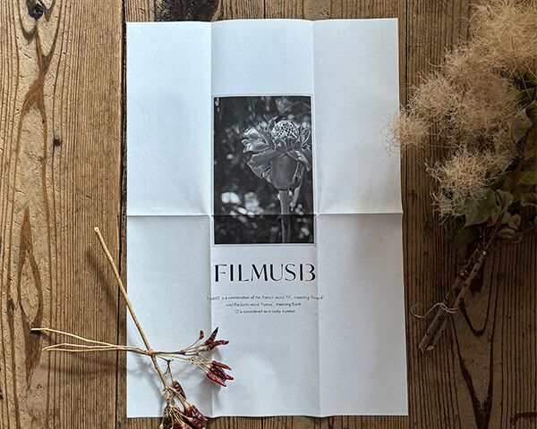
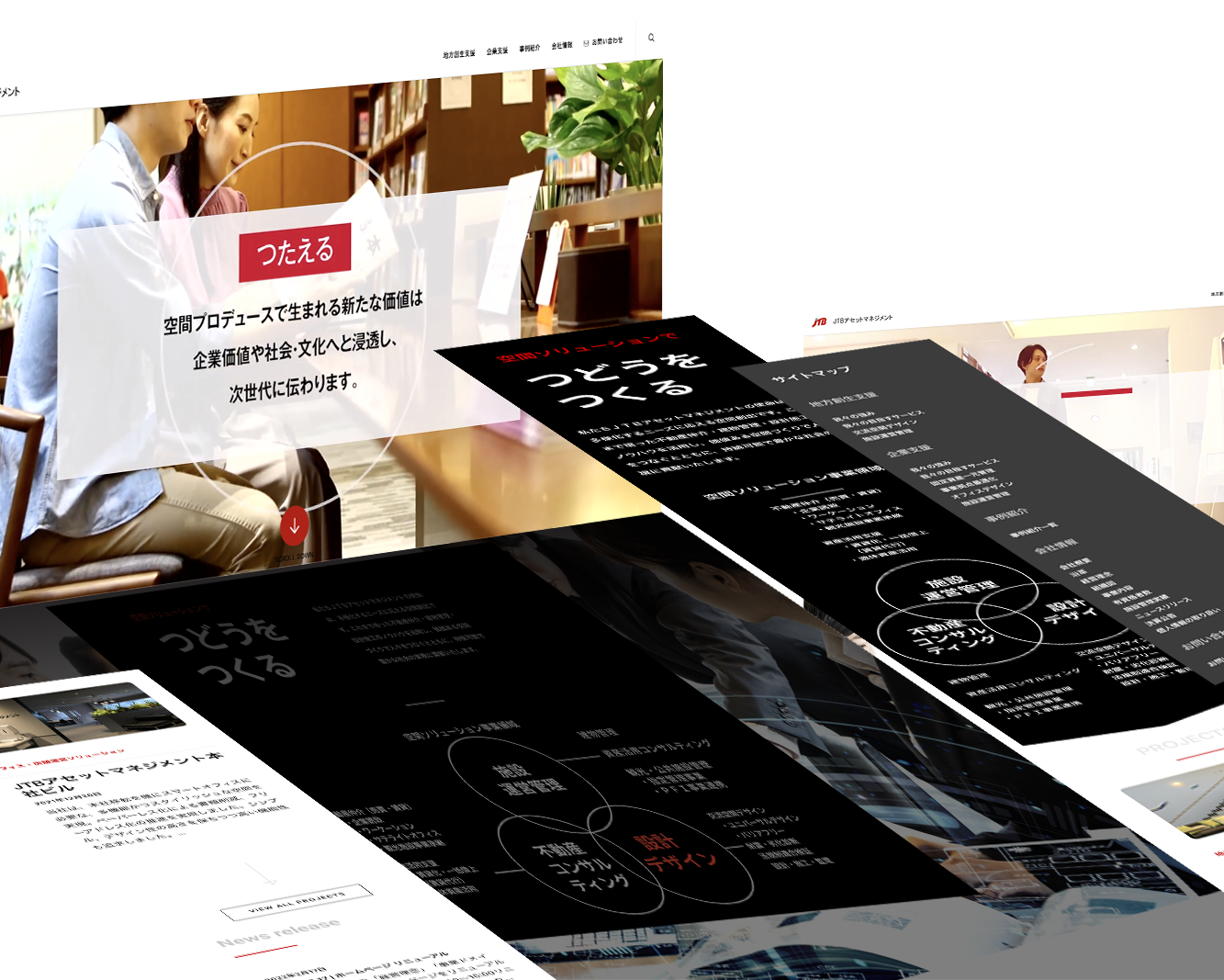
Printing as a Form of Branding
名刺からはじまるブランディング
ブランドの世界観を具現化する
Bringing a Worldview to Life Through Print Media
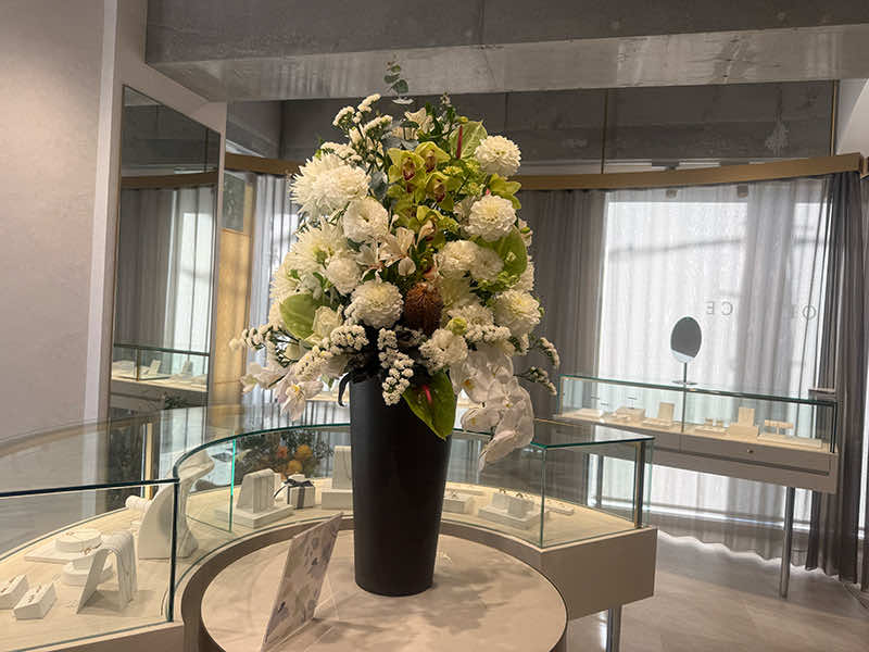
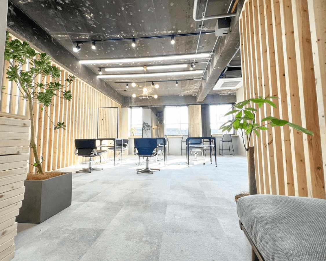
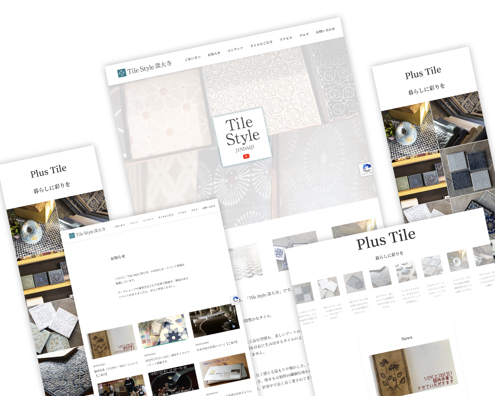
新店舗オープンに伴い、紙媒体全般の企画・制作を担当。複数回にわたり訪問し、直接対話するなかでブランドの思想や現場の温度感をヒアリング。使用シーンまで踏み込んで設計することで、単なる販促物にとどまらない統一感あるビジュアルコミュニケーションを構築した。一切の妥協をすることなく、質感設計や配色設計を通じて、ブランドの世界観を印刷物として具現化している。
In conjunction with the opening of a new store, I was responsible for the planning and production of print materials. Through multiple on-site visits and direct conversations, I gathered insights into the brand’s philosophy and the atmosphere of the store. By designing with specific usage scenarios in mind, I created a cohesive visual communication system that goes beyond mere promotional materials. Without compromising on any aspect, I brought the brand’s worldview to life in print through meticulous attention to texture and color schemes.
To pursue perfection
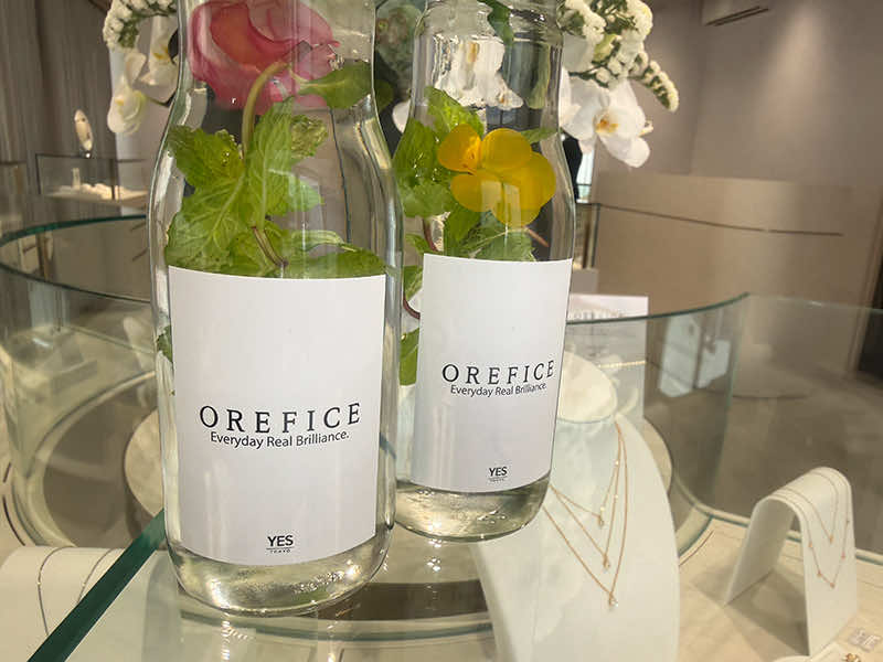
Print materials that stand out clearly
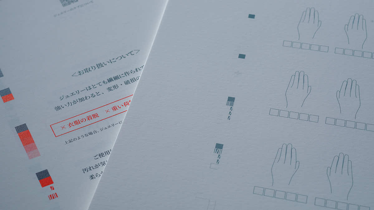
クライアントが貫く、強い意志に裏打ちされた高品質への愚直な姿勢。ヒアリングを重ねる中で、その歴史の根底に流れる信念に深く共感し、そこを起点にクリエイティブディレクションを展開。取り扱うジュエリーにふさわしい印刷表現を追求し、素材や仕上がりに徹底してこだわる。決して安価ではない商品だからこそ、顧客の手に渡る瞬間やスタッフが手渡す所作までを想定し、他社と明確に差別化される印刷物へと落とし込んだ。
The client’s unwavering commitment to quality, backed by a strong sense of purpose. Through repeated consultations, we deeply resonated with the core beliefs that underpin their history, and used this as the foundation for our creative direction. We pursued a print aesthetic befitting the jewelry they offer, paying meticulous attention to materials and finishes. Precisely because these are not inexpensive products, we envisioned every detail—from the moment they reach the customer’s hands to the manner in which our staff presents them—and translated this into printed materials that clearly set us apart from the competition.
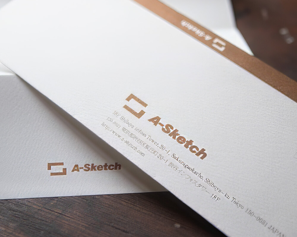
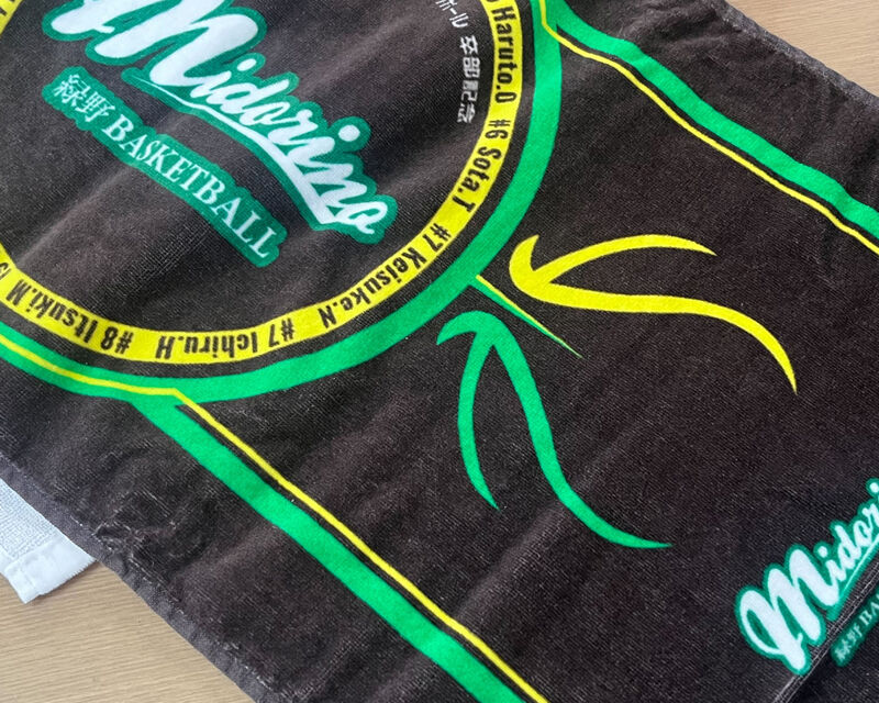
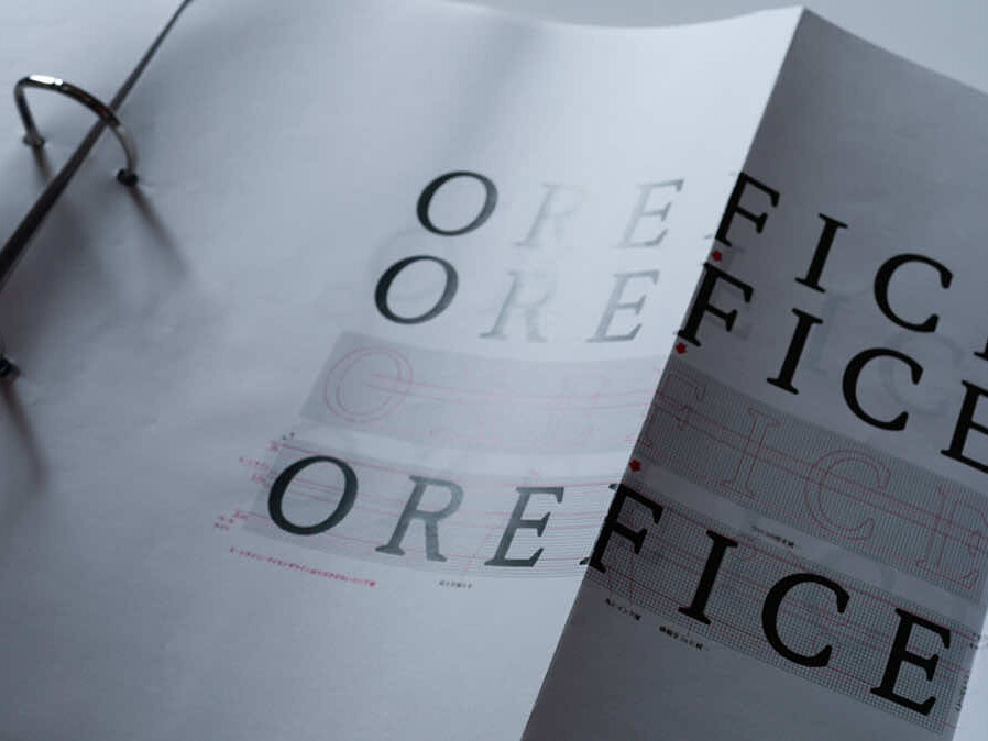
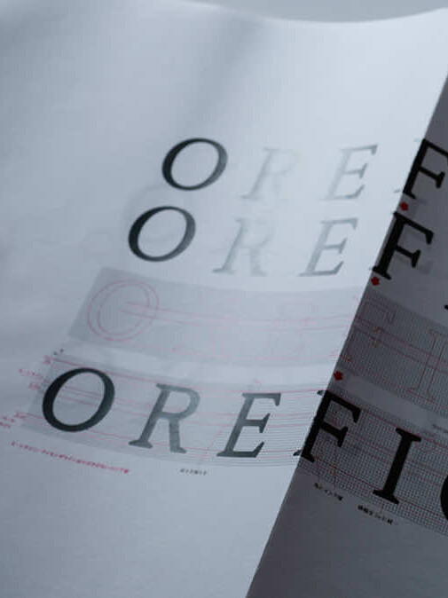
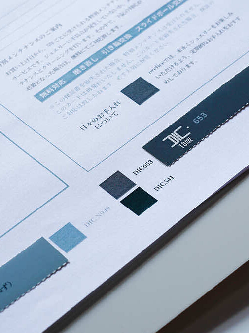
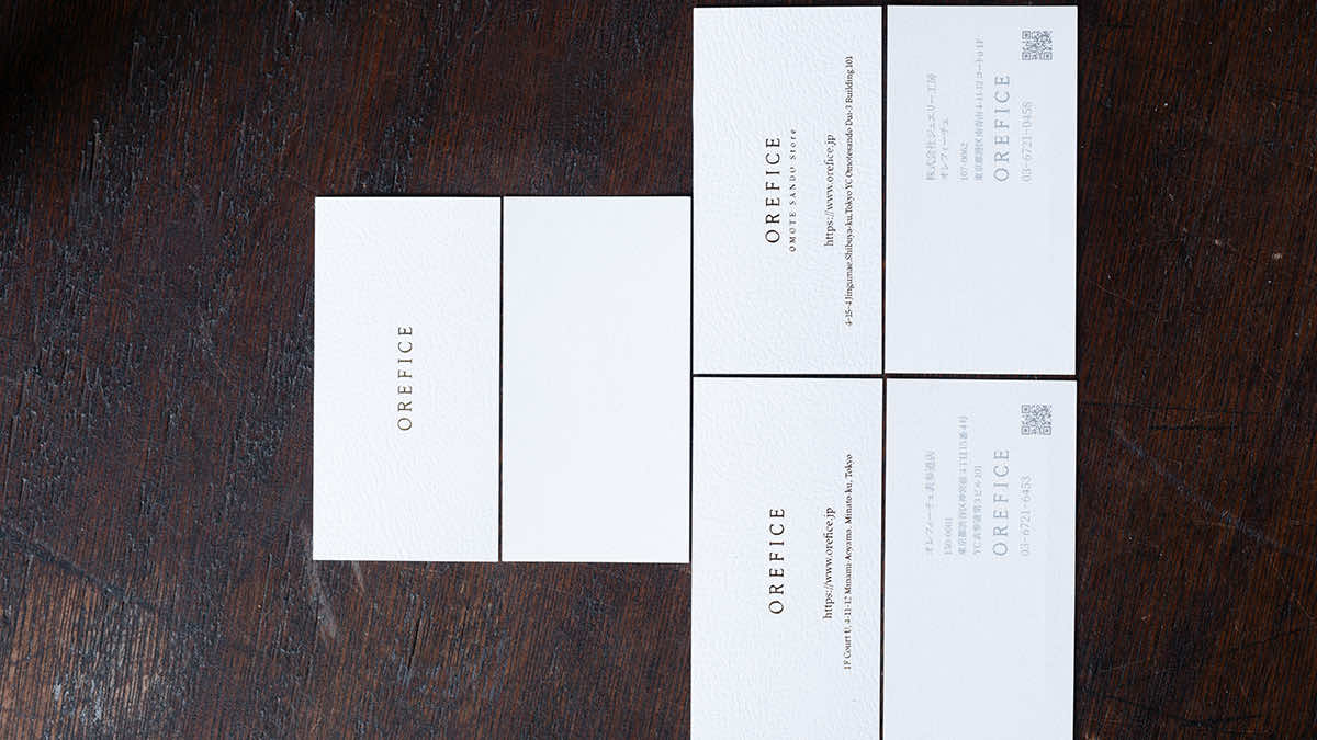
ロゴの微細なチューニングもお任せいただいている。ブランディングに必要なアイテムの取り寄せも実施。5つのパターンを検証したうえで、汎用性の高いヴァンヌーボーを選択。名刺にはシルバーボードを採用し、金箔が美しく映える仕様に。細部までこだわり抜いた「差別化」は、名刺サイズでも表現している。
ブランディングとは、顧客体験でもある。目に見えるもの触れるもの。ビジュアルコミュニケーションにおいて生じるすべてのタッチポイントに、美しい秩序と統一性を持たせることに注力した。手に取ったときの質感やサイズ、眺めたときの印象、テキストの読みやすさ…手を抜かず、出来得るこだわりを詰め込んでいる。
名刺のデザインについては、テンプレートとなる印刷台紙を設計することで、ブランドの世界観と品質を担保しながら、運用効率を最適化。共通部分はあらかじめ印刷しておき、必要な情報のみを刷り込みで対応する仕組みを構築。これにより、都度フル印刷を行う非効率を避けつつ、柔軟な内容更新にも対応。品質を損なうことなく、安定したアウトプットとコストパフォーマンスの両立を実現している。
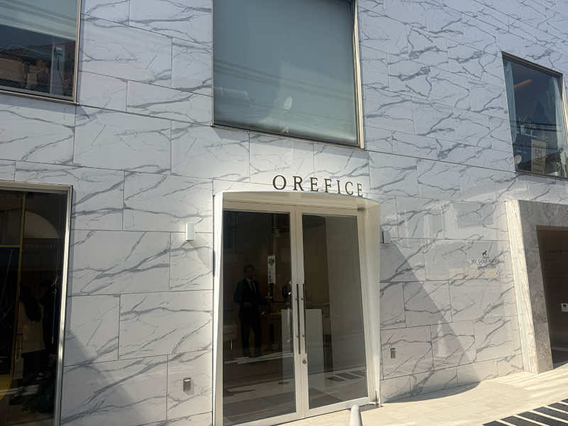
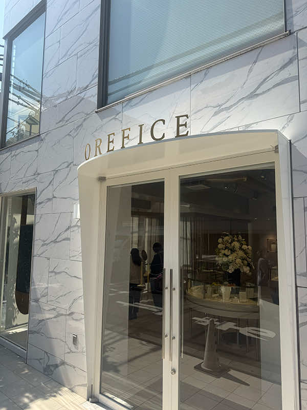
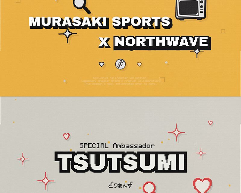
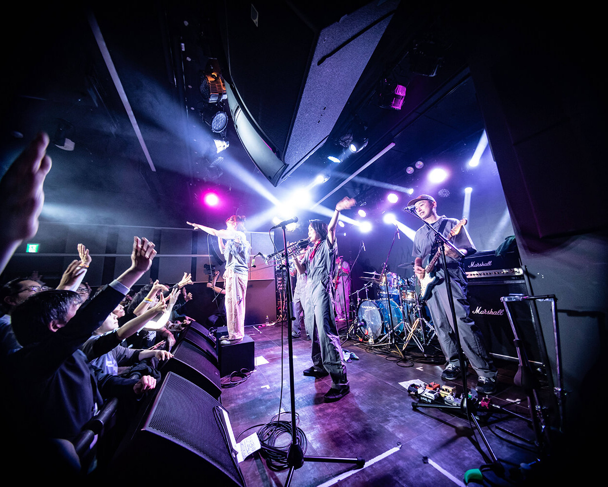
A new store that has opened
印刷物が減少しデジタル化が進む現代においてこそ、ウーマが培ってきた印刷物制作の知見と情熱は価値を発揮する。紙、デジタル、撮影、ロゴ、ライティングといった個別の手法にとどまらず、ブランディングに必要な要素を横断的に捉え、最適な形で組み合わせる。その積み重ねによって、一貫性と深度のあるブランド体験を構築できることが、ウーマの強みである。
In today’s society, where print materials are declining and digitalization continues to advance, Woorma’s expertise and passion for print production become even more valuable.
Rather than focusing on a single discipline—such as print, digital, photography, logo design, or writing—we pursue and integrate the methods necessary for effective branding. By combining these elements strategically, we create cohesive and deeply engaging brand experiences.