TEASER WEB DESIGN
ティザーサイト制作
MEDICOM TOY(メディコム・トイ)社が開発し、世界中で愛されているアクションフィギュア「BE@RBRICK(ベアブリック)」のティザーサイト制作事例。
A teaser website for the world famous action figure, BE@RBRICK by MEDICOM TOY.
プレゼン内容に縛りなし。与えられるのは、あらかじめ決定している“テーマカラー”だけ。それをもとに構想する、という極めて自由度が高いオーダー。プレゼンまでの約1ヶ月、BE@RBRICKの世界観を念頭に、柔軟な発想でアイデアを創出。もちろん過去に公開されたティザーサイトの研究や購買層のニーズも入念に考察し、考えに考え抜いたアートディレクションを施している。ファンとしての期待感、実際にBE@RBRICKを手したときのワクワク、世界中が受け入れるグローバルなデザイン…さまざまな引き出しをフルオープンにして「今まで見たこともない」デザインを提案した。(ティザーサイトの世界観を理解していただきました良きクライアント、努力を惜しまずタイトなスケジュールの中、共に制作を進めてくれた仲間に感謝します。)
The order for this job was to use the provided theme color, and other than that, we were totally free to design anything we want. For a month, before the presentation, we researched about the product, the company, and the consumers thoroughly, and made an art direction by thinking outside of the box. For the global audience, for the loyal BE@RBRICK fans, for the people who takes this product in their hands for the first time..., we came up with a design that is meant to be something no one has seen before, but also attracting to everyone.(Although this was a project with a really, really tight schedule, our staffs worked hard to make this happen. We'd like to thank you all for your hard work.)
SERIES 42
シリーズ42
THANK YOU FOR THE 20th ANNIVERSARY!!(祝!ベアブリック誕生20周年!)、さらにMEDICOM TOY(メディコム・トイ)25周年という記念すべきBE@RBRICKシリーズ42。テーマカラーは「レインボーメッキ」。過去、BE@RBRICKシリーズにないデザインを…という強い想いのもと、フワフワと空中に浮いている神秘的な印象のビジュアルを構想した。
Celebrating the 20th anniversary of BE@RBRICK and the 25th anniversary of MEDICOM TOY, the BE@RBRICK series 42 was born with a shimmering plated rainbow color as the main theme color. We wanted to create a fresh new design, and came up with the idea of a mystical floating image.

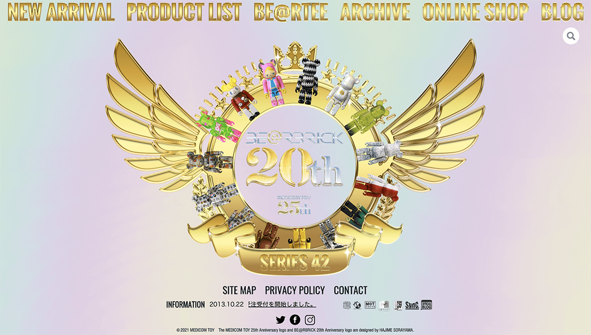
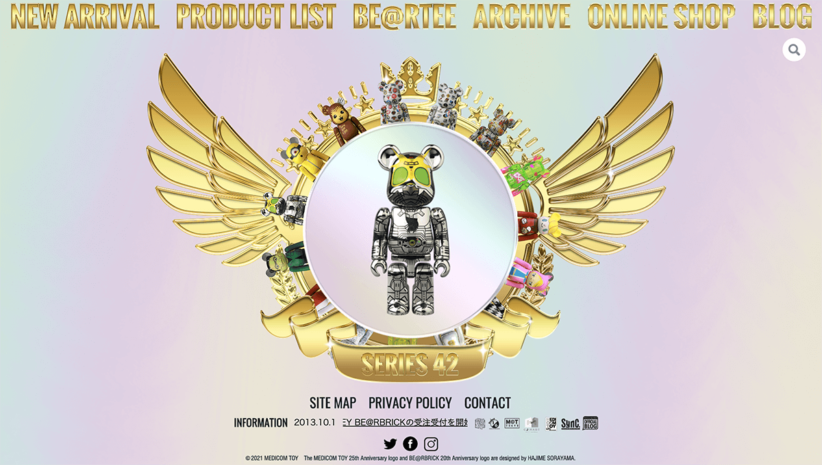
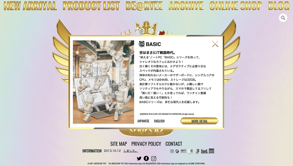
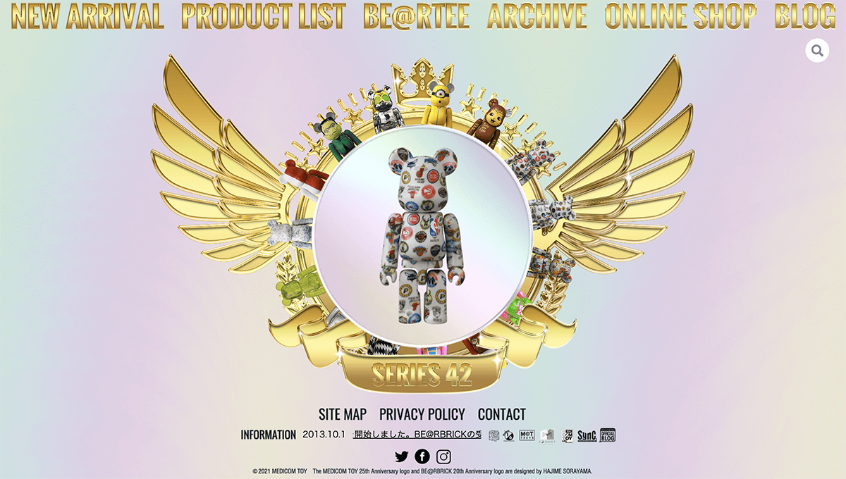
歪む虹色の空間にふわりと浮かぶ黄金のステージ。そこにBE@RBRICKシリーズ42のコレクションが並び、摩訶不思議な世界観を創り出した。各ベアにカーソルを当てると、中央に小気味良く姿を現す演出で、さらなる遊び心を表現している。
In the glimmering rainbow background, rises a golden stage, and the new BE@RBRICK series 42 collection lines up in a mystical atmosphere. Each bear shows up in the middle of the stage when you point the cursor.
STAFF CREDITCoding : Dohyoung GimDirection・HTML support : Tomoyuki MiyakawaArt Direction : Hanamaru Fujii
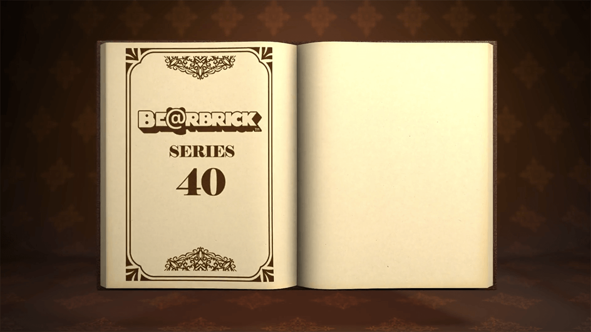
SERIES 40
シリーズ40
SERIES 40
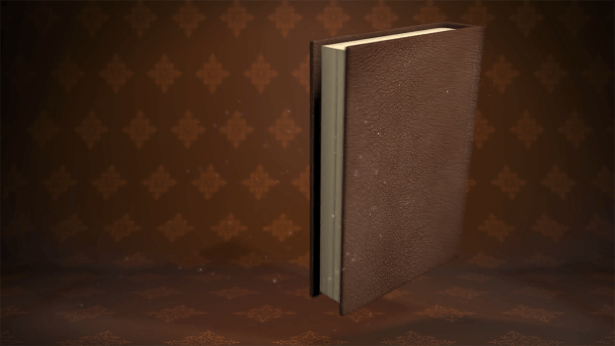
BE@RBRICKシリーズ40のテーマカラーは「ブラウン」。古く孤高な空間に落とされた、重厚感ある書物。一見、落ち着いた雰囲気を創りあげているが、各所に遊び心を忍ばせ、見た人を期待感でワクワクさせるものに。過去公開されたティザーサイトから大きく路線変更した提案で、クライアント企業からも高評価いただいた。
The theme color of BE@RBRICK Series 40 is "Brown. A massive book dropped into an old and isolated space. At first glance, it creates a calm atmosphere, but a sense of playfulness has been crept into various parts of the work to excite viewers with a sense of anticipation. The client company gave high marks to this proposal, which is a major change from the teaser site released in the past.
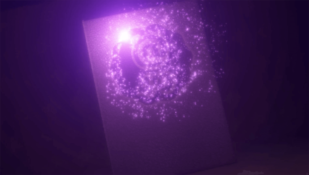
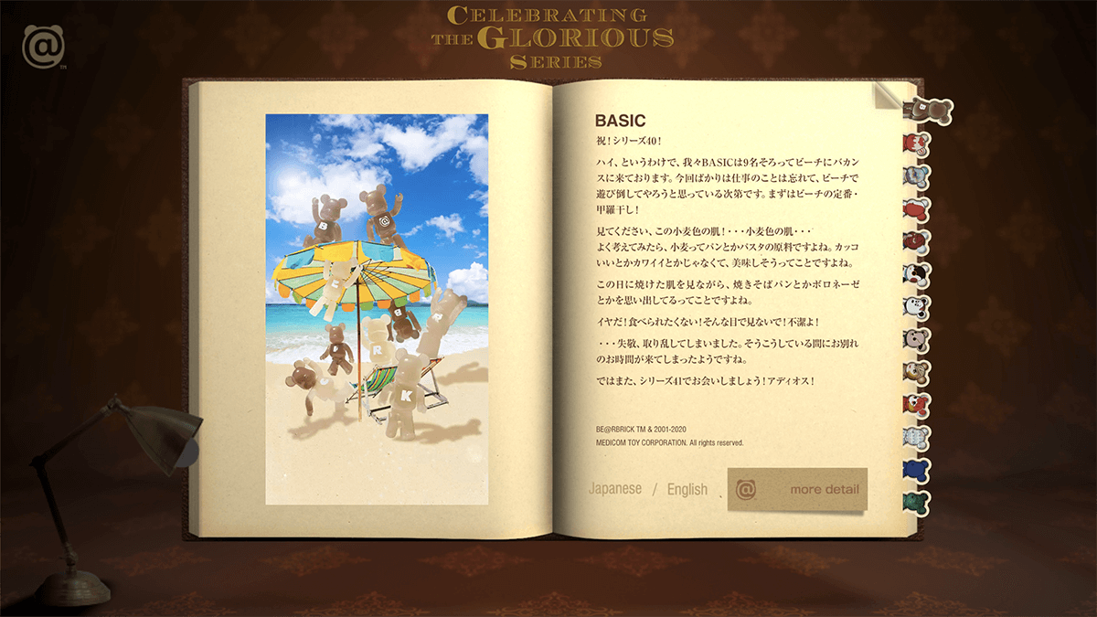
BE@RBRICKを手にした瞬間のワクワク感を、あえてビンテージ感ある革張りの書物と、その上を走る紫色の光で表現。コレクション各ベアを栞に見立て、ページを開くとそこに各ベアが掲載されている、という物語性も演出。まるで古書を所蔵している歴史ある図書館のような世界観で、BE@RBRICKシリーズ40の希少性を表現した。
The excitement of holding a BE@RBRICK in one's hands is expressed through the vintage-looking leather-bound book and the purple light running over it. Each bear in the collection is used as a bookmark, and when you open the page, you will find each bear listed there, creating a sense of narrative. The world of the BE@RBRICK Series 40 is expressed as if it were a historical library that holds old books, and the rarity of the BE@RBRICK Series 40 is also expressed.
STAFF CREDITOPENING CG : Ryosuke FukuchiCoding : Dohyoung GimDirection・HTML support : Tomoyuki MiyakawaArt Direction : Hanamaru Fujii
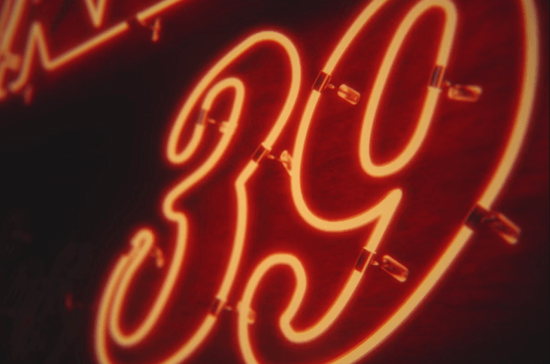
SERIES 39
シリーズ39
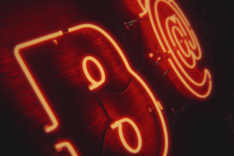
テーマカラーに「オレンジ」が採用されたBE@RBRICKシリーズ39。オープンした瞬間、オレンジ色のネオンサインが怪しく光り、別世界へと引き込まれる…そんな没入感も視野に入れデザインに落とし込んだ。
The BE@RBRICK Series 39, which uses "orange" as its theme color, was designed with this immersive experience in mind: the moment it opens, the orange neon sign glows suspiciously, drawing you into another world.
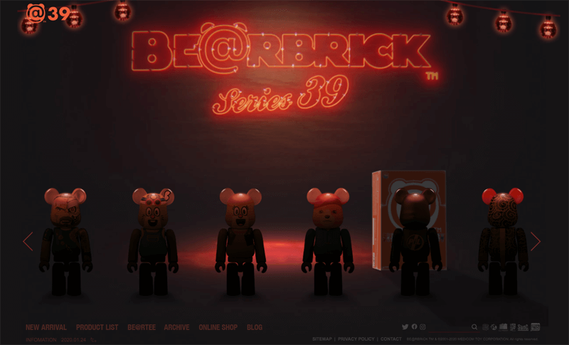
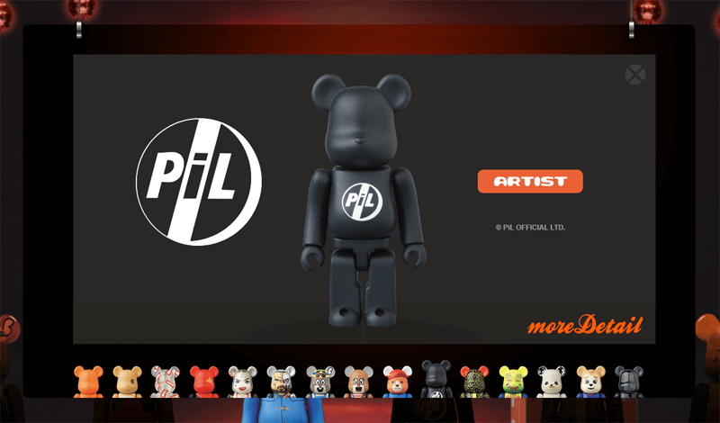
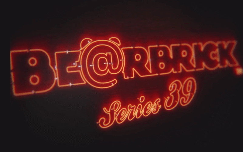
コンセプトは「ベアが並ぶオトナの秘密基地BAR」。逆光で並ぶコレクション。マウスの動きで背景のネオンサインやランプ、外箱がずれ奥行きある空間を演出。各ベアをクリックすると、オレンジのネオン光線が商品をトレースし、詳細情報がポップアップ。ポップアップも奥行き感を出すべく、奥から手前へとブランコのように落ちてくる。コンテンツの表現は、とにかくわかりやすく伝えることに注力。あえてギミックを抑えたマイクロインスタラクションだけで演出を進めた。
The concept is "A secret base bar for adults where bears are lined up". A collection of bears lined up in a backlit room. Neon signs, lamps, and outer boxes in the background shift with the movement of the mouse, creating a space with depth. When clicking on each bear, orange neon rays trace the product and detailed information pops up. The pop-ups also fall like a swing from the back to the front to create a sense of depth. The focus of the content expression is to convey information in an easy-to-understand manner. We dared to reduce the gimmicky elements, and only used micro-instructions in the presentation.