Project Background & Concept Development
プロジェクト背景とコンセプト設計
アミューズは音楽業界のCD市場縮小を受け、配信に特化した新レーベル「A-Sketch」の立ち上げを決定しました。当時無名だったワンオクロックやフランプールなどの新人アーティストを配信中心で展開する革新的な企画でした。
プロジェクト名の「A-Sketch」は「アミューズの、あたらしいスケッチ」という意味を込め、「スケッチは、世界をどう切り取るか」をコンセプトに設定。エッジが効いているが綺麗目でミニマル、かつロックな感じという方向性を手書きのマップで整理しました。
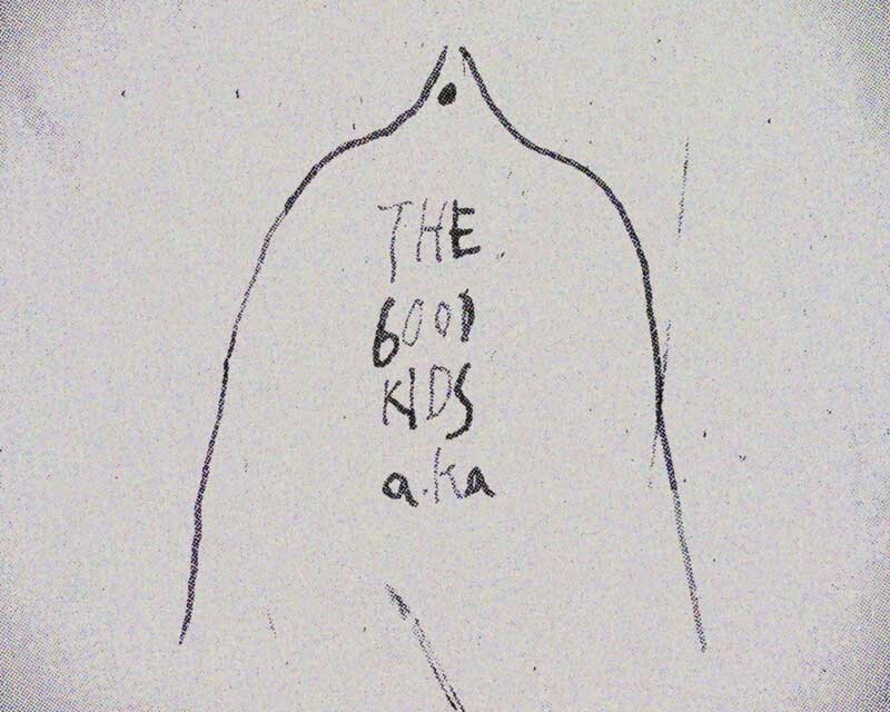
制作プロセスでは100案出しから開始。手書きスケッチで様々なロゴの形を方眼用紙に描き起こし、アミューズのメインカンパニーカラーである黄色軸をベースに、蛍光ピンクやシルバーなど多様な色彩検討を重ねました。この段階では「Aの文字」に引っ張られがちでしたが、音楽レーベルらしさを保ちながらスポーツブランド的な印象を避けることを重視しました。
Amuse decided to launch a new distribution-focused label “A-Sketch” in response to the shrinking CD market in the music industry. This innovative project aimed to promote emerging artists like ONE OK ROCK and FLOW (who were unknown at the time) through digital distribution.
The project name “A-Sketch” embodies “Amuse’s new sketch,” with the concept “sketch is how you frame the world.” We established a direction that was edgy yet clean, minimal, and rock-oriented, organizing this vision through hand-drawn concept maps.
Our creative process began with generating 100 initial concepts. We sketched various logo forms by hand on grid paper, exploring diverse color palettes based on Amuse’s main company color of yellow, including fluorescent pink and silver variations. While we initially gravitated toward the letter “A,” we focused on maintaining a music label aesthetic while avoiding sports brand associations.
Logo Design & Decision Process
ロゴデザインと決定プロセス
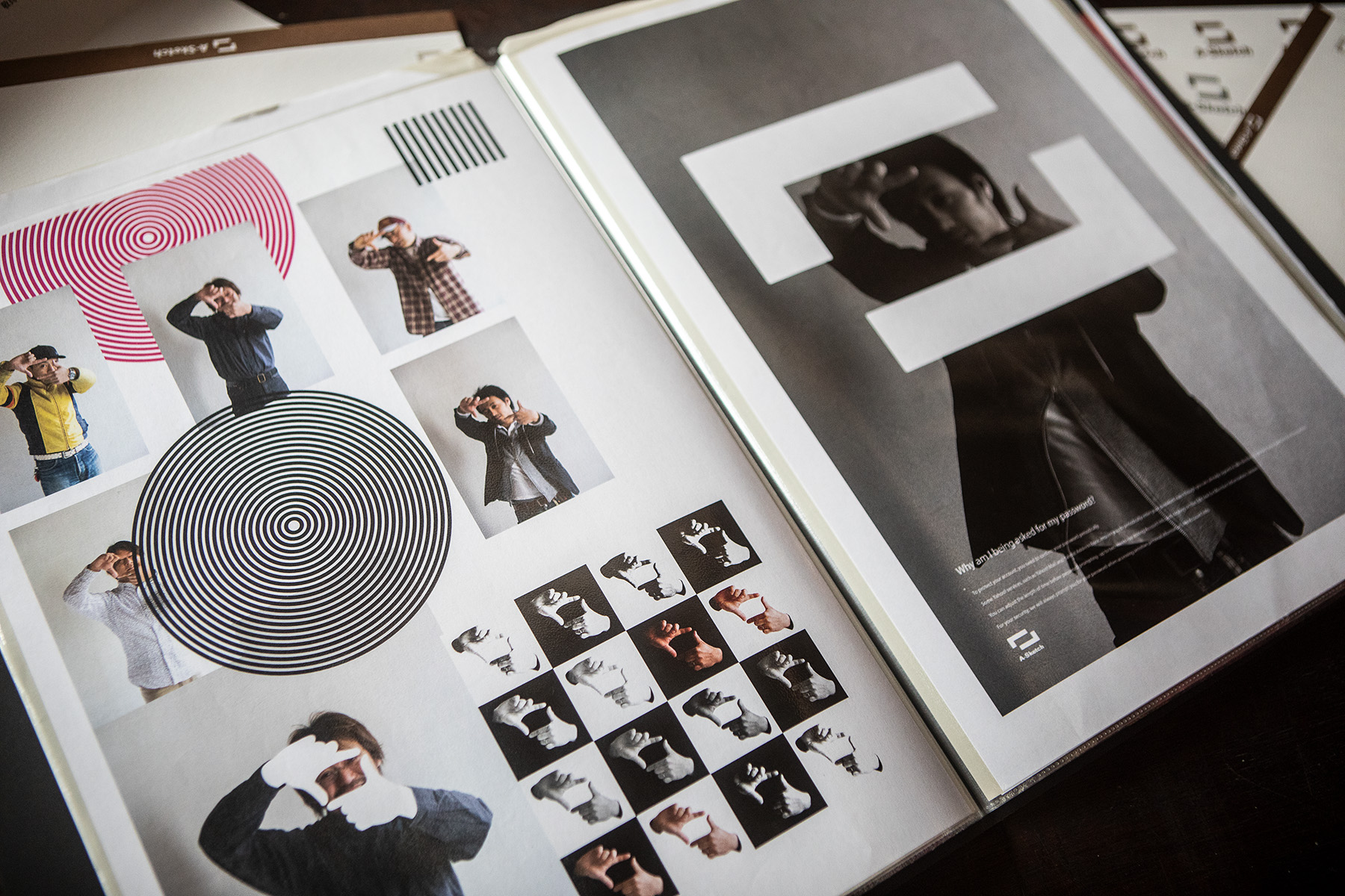
100案の手書きスケッチから使用可能な要素を抽出し、デジタルトレース作業に移行しました。この段階で「人が世界を覗く時のフレーム」というコンセプトを具現化したロゴマークが誕生。指でフレーミングする際の感覚を表現することで、A-Sketchの本質を視覚化しました。
ロゴタイプの開発では、DAFONTサイトを活用して約100種類のフォントを検討。ストレートなものからヒップホップ、テクノ調まで幅広く検証し、「読ませたい」デザイナーとして可読性を重視しながら選定を進めました。ロゴマークとロゴタイプの組み合わせ(コンビネーション)についても、縦長レイアウト時の配置など詳細な検討を行いました。
社内のデザイナーにも案出しを依頼しましたが、初心者にありがちな「音符やギターモチーフの使用」は禁止事項として設定。音楽レーベルだからといって直接的な音楽モチーフに頼らず、より本質的なブランド表現を追求しました。最終的にクライアントプレゼンでは、全案を同サイズでプリントアウトし、手に取れる状態で提案することを重視しました。
We extracted usable elements from 100 hand-drawn sketches and proceeded to digital tracing. At this stage, we developed a logo mark that embodied the concept of “a frame through which people view the world.” By expressing the sensation of framing with fingers, we visualized the essence of A-Sketch.
For logotype development, we utilized the DAFONT website to examine approximately 100 fonts, ranging from straight designs to hip-hop and techno styles. As a designer who prioritizes readability, we emphasized legibility while making our selections. We also conducted detailed considerations for logo mark and logotype combinations, including vertical layout arrangements.
We also requested concept submissions from internal designers, but established a prohibition against beginner-typical approaches like “using musical notes or guitar motifs.” Rather than relying on direct musical motifs just because it’s a music label, we pursued more essential brand expression. For the final client presentation, we emphasized presenting all concepts printed at the same size in a tangible format that could be physically handled.
Brand Implementation & Application
ブランド展開と実装
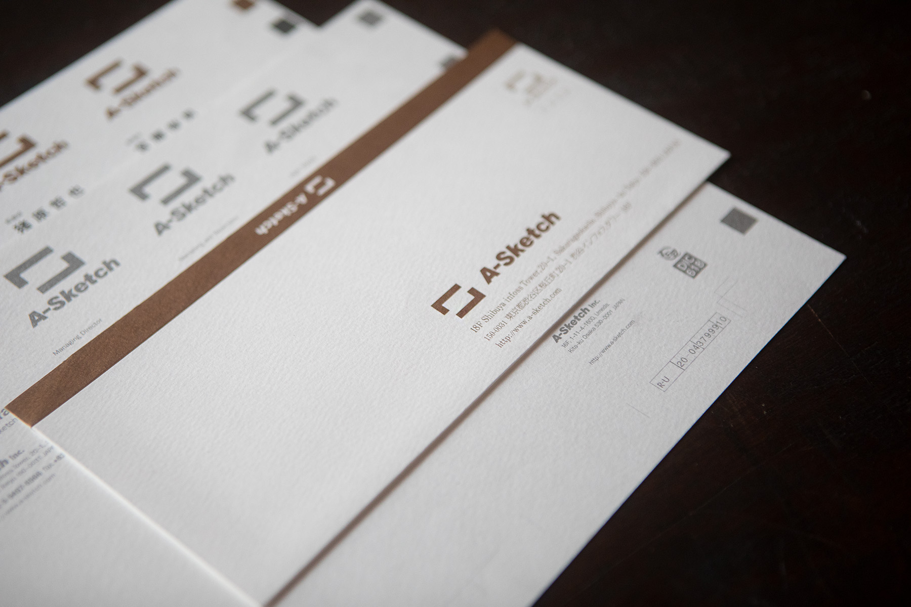
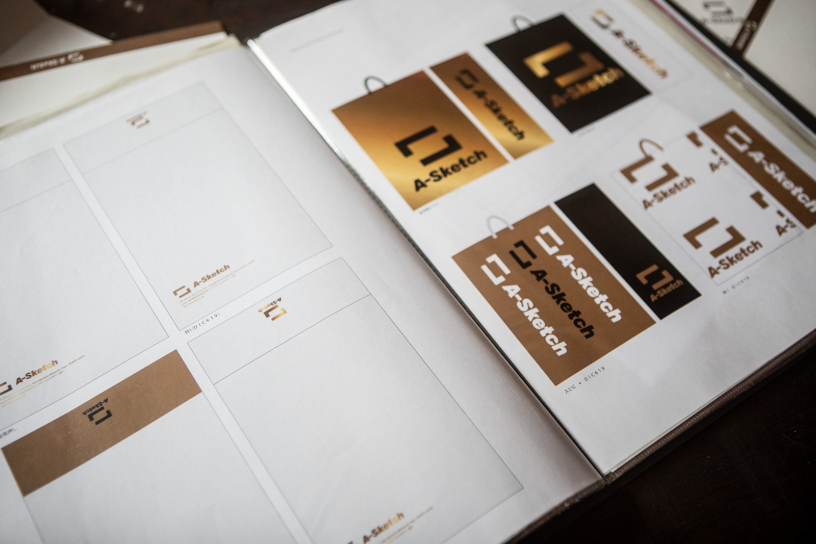
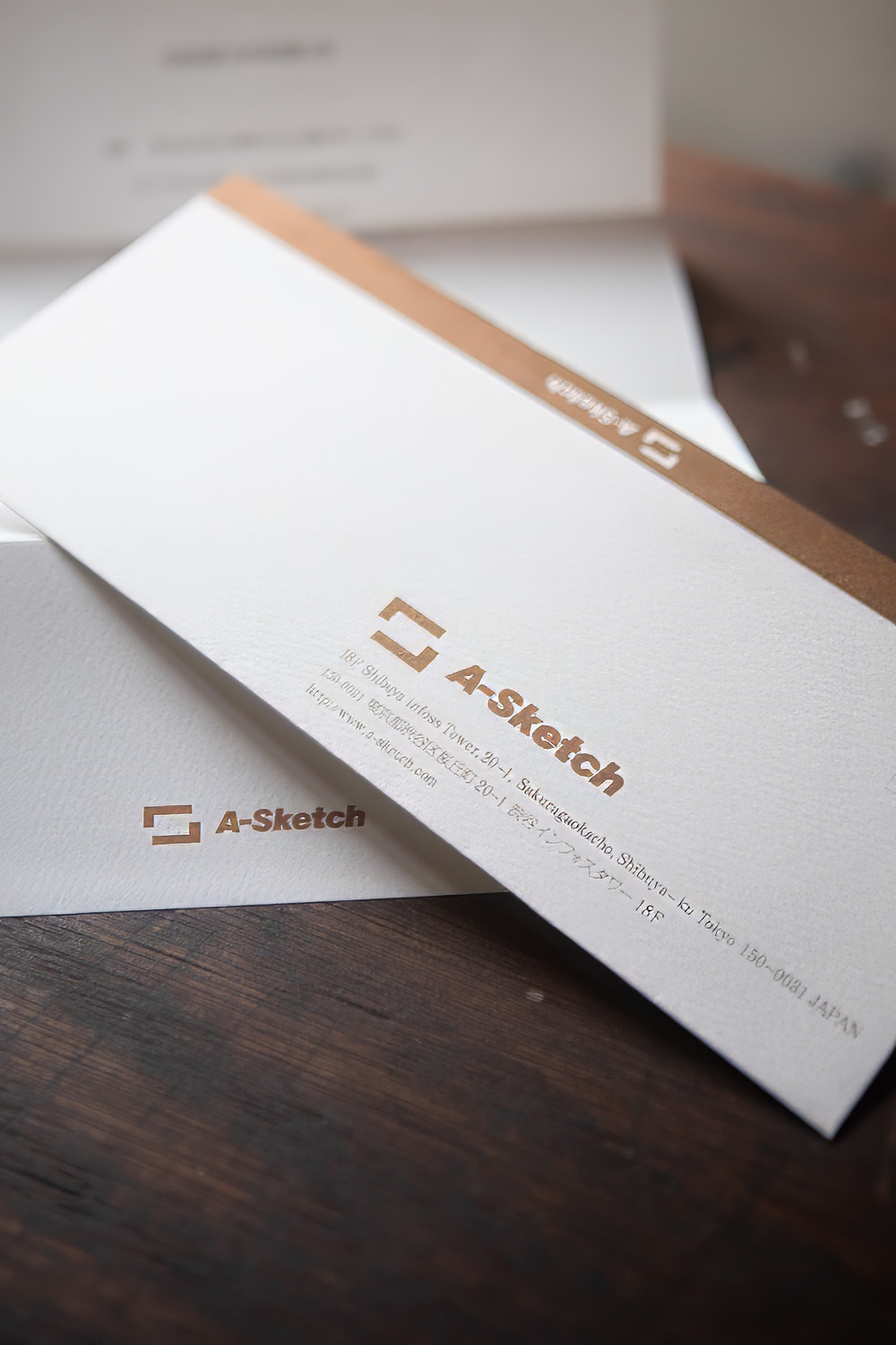
ロゴ決定後は、名刺、封筒、CDケース、紙袋など各種アプリケーションの展開を実施。特色として赤金(DIC619)を採用し、マット系用紙への箔押し加工で高級感のある仕上がりを実現しました。会社設立のお知らせなど重要文書では、金と銀の箔押しを使い分け、将棋の駒のような洗練された印象を演出しました。
求人広告ではオリコンへの掲載を行い、音楽業界への本格参入をアピール。Webサイトも制作し、当時流行していたFlashを用いたマウスジェスチャーによるインタラクティブな体験を提供しました。サイト内にはアーティスト情報やアルバム情報を効率的に管理できる仕組みを構築し、レーベル運営の実務をサポートしました。
最終的にアプリケーションマニュアル(ブランドガイドライン)を作成し、ロゴの正しい使用方法、縦配置時のルール、禁止事項などを明文化。これにより長期的なブランド価値の維持と、一貫したビジュアルアイデンティティの運用を可能にしました。プロジェクト全体を通じて、ブランディングは単なるデザイン作業ではなく、クライアントのビジネス戦略を支える重要な基盤であることを実感した案件となりました。
Following logo finalization, we implemented various applications including business cards, envelopes, CD cases, and paper bags. We employed red-gold (DIC619) as a special color and achieved a premium finish through foil stamping on matte paper. For important documents like company establishment announcements, we strategically used gold and silver foil stamping to create a sophisticated impression reminiscent of shogi pieces.
We placed recruitment advertisements in Oricon to demonstrate serious entry into the music industry. We also developed a website featuring interactive experiences using Flash mouse gestures, which were popular at the time. The site incorporated efficient systems for managing artist and album information, supporting the practical operations of label management.
Finally, we created an application manual (brand guidelines) that documented proper logo usage, vertical layout rules, and prohibited practices. This enabled long-term brand value maintenance and consistent visual identity operation. Throughout the entire project, we realized that branding extends beyond mere design work to serve as a crucial foundation supporting clients’ business strategies.